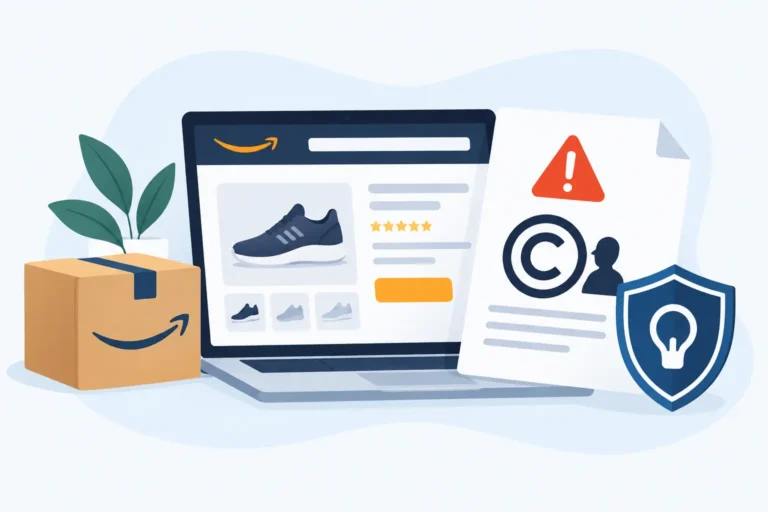
Ever clicked “Add to Cart” only to return the item a week later? You’re not alone, and sometimes, the problem isn’t your product; it’s the way it was shown. Explainer image are the first thing your customers see, and the wrong type can lead to disappointment, confusion, and yes… more returns.
In this guide, we’ll walk through 7 explainer image types that actually reduce returns. You’ll see which visuals build confidence, which ones create clarity, and which ones might be unintentionally setting your customers up for a refund.
By the end, you’ll know exactly how to present your product so shoppers feel informed and satisfied, before they even click “Buy.”
1. Standard Product Explainer Images
Standard product images are the foundation of your entire visual gallery. These photos show your product in its most accurate and unembellished form, no unnecessary props, no misleading effects. On Amazon, this typically means a pure white background (#FFFFFF), the product occupying about 85% of the frame, and a minimum resolution of 1000px to enable zoom.
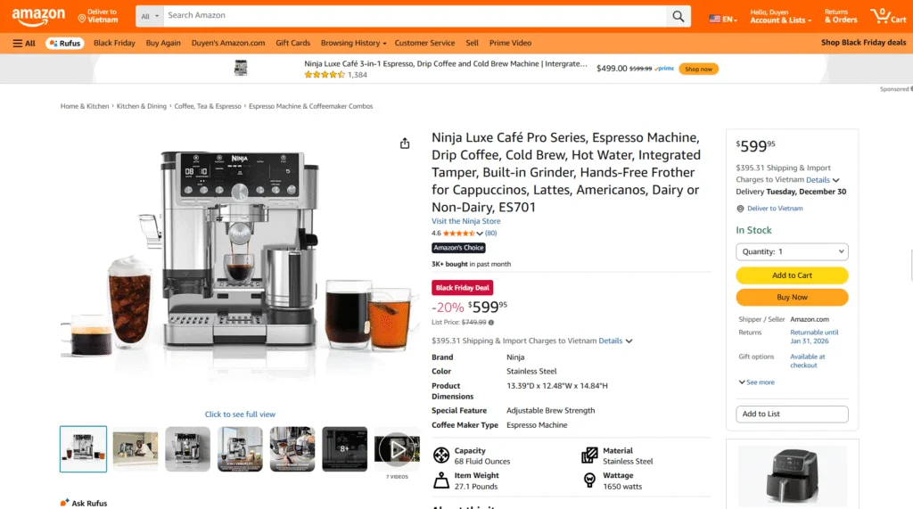
Source: Amazon
The figure “22% of returns are due to the product looking different” emphasizes that expectation mismatches may become expensive returns and loss of trust. Customers will convert better when they know precisely what they are going to get, and the level of dissatisfaction will be reduced.
To produce good quality standard images, it is important to remember to do the following essentials:
- White background with no light patterns.
- Product fills 80-85% of the frame.
- Zoom: resolution of 1500-3000px.
- No actors, no dialogue or unnecessary elements, no distractions.
Clear images of products help customers see the item’s real size, shape, and color. They minimize confusion, gain credibility, and create a sound base on which the later, more creative lifestyle or infographic pictures rely. The initial step toward a credible, conversion-ready listing is a high-quality image.
2. Lifestyle Images
Lifestyle images are where your product stops being “just a product” and starts becoming part of someone’s real life. They help shoppers imagine how your item fits into their daily routine, on their nightstand, in their cozy reading corner, or right next to their bed after a long day. And honestly, isn’t that the moment when people really decide to buy?
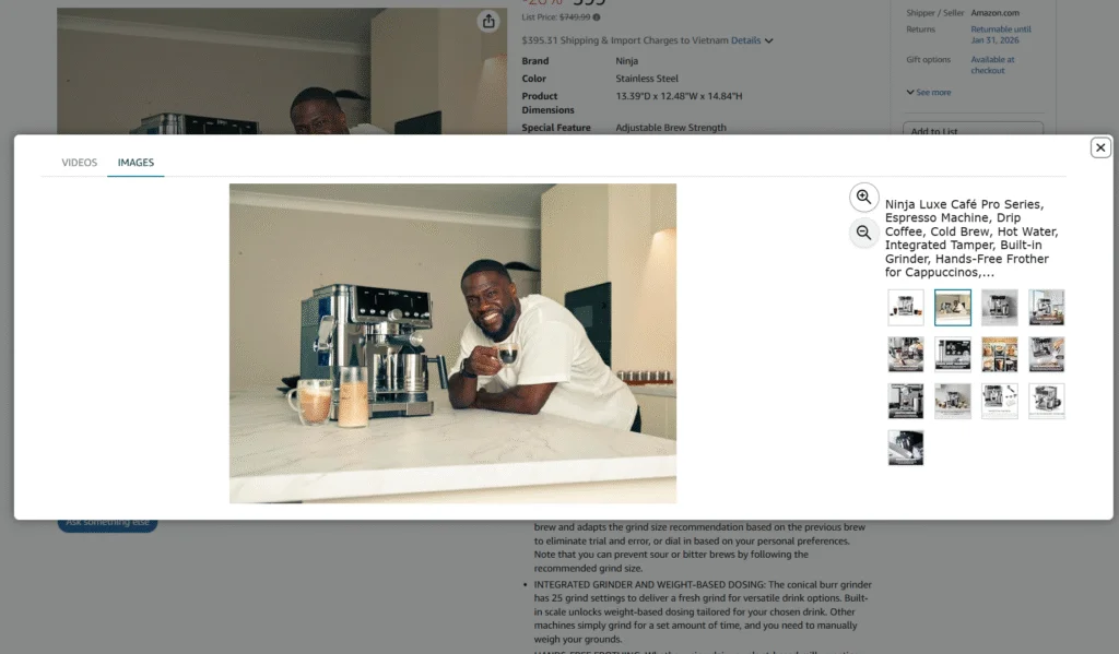
Source: Amazon
When someone scrolls through your listing, lifestyle photos answer the silent questions they already have: “Will this look good in my room? Will it match my vibe? Can I actually picture myself using it?” If your images can make them say “yes,” you’re halfway to the sale.
Great lifestyle photos do more than show a pretty setup; they create a mood. They help shoppers feel something. And that feeling directly shapes whether they add to cart or scroll away.
Here are a few quick things your lifestyle shots should highlight:
- Real-life use in a relatable setting.
- Clear scale so buyers know the true size.
- A consistent aesthetic that matches your brand vibe.
- An emotional appeal that makes viewers imagine ownership.
3. Infographic or Annotation Images
Infographic or annotation images are the fastest way to explain your product without making shoppers read long paragraphs. Instead of leaving people to guess about size, features, or materials, you package everything into a single, clean, easy-to-scan visual. It’s the kind of image that instantly answers the top questions buyers usually have, sometimes even before they realize they were wondering about them.
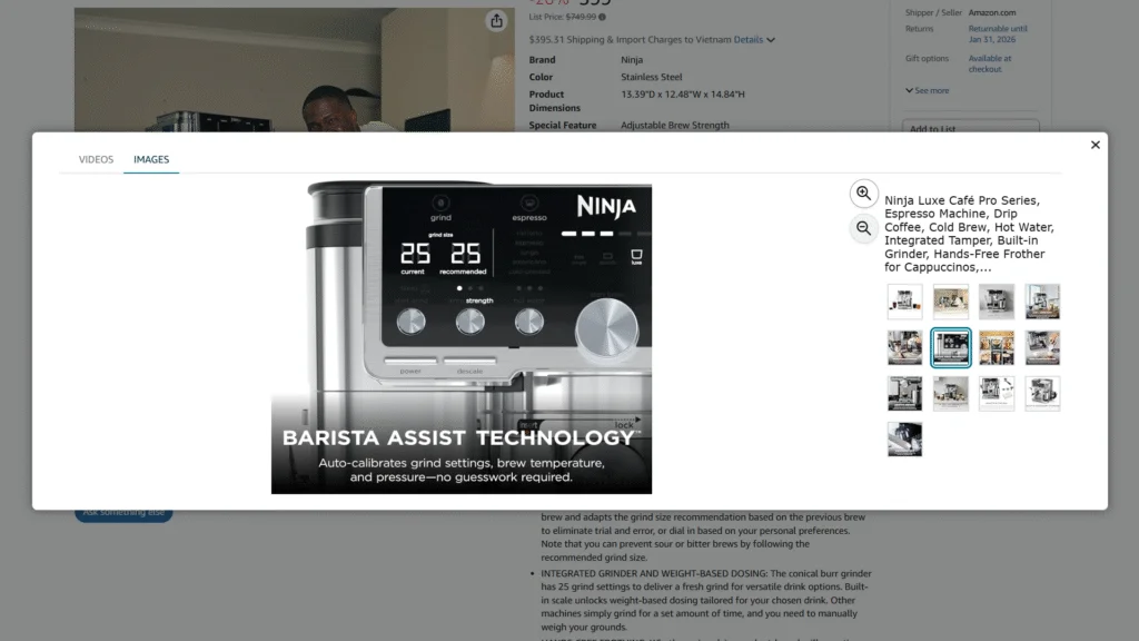
Source: Amazon
These visuals work especially well when shoppers are comparing multiple products on the same page. A clear infographic shows what makes your item stand out, reducing confusion and hesitation. Think of it as your “5-second pitch”, simple, direct, and impossible to miss.
| IMPORTANT: To make your infographic effective, focus on clarity and simplicity: show the key features, highlight the dimensions, and keep the layout clean so nothing competes for attention. |
4. 360-Degree or Rotatable Images
360-degree or rotatable images give shoppers something they absolutely love: control. Instead of guessing what the back, sides, or hidden angles look like, they can rotate the product freely and explore every detail. It feels interactive, trustworthy, and a lot closer to an in-store experience, something online shopping often struggles to deliver.
When buyers can spin your product, they spend longer engaging with it, and that extra attention often turns into higher confidence… which turns into higher conversion. It also reduces returns because shoppers know exactly what they’re getting. No surprises, no confusion, no “I didn’t realize it looked like this from the side.”
To make these images effective, the rotation should be smooth, well-lit, and consistent across frames. Every angle needs to look clean and accurate if you’re selling decor, lighting, or any product where texture and shape matter; a 360 image can be a game-changer.
5. Comparison Images
Comparison images are essential for helping customers see the differences between product versions, sizes, colors, or features right on the product page. For example, placing two versions of the same bedside lamp side by side instantly shows differences in height, brightness, and design. This reduces surprises and lowers the chance of “buying the wrong one.”
These images also help boost buyer confidence. When shoppers clearly understand what they’re choosing, returns drop. A few tips: always use the same shooting angle, consistent lighting, and highlight the most important differences.
6. Exploded View or Component Images
Exploded view or component images show your product taken apart: every piece laid out, labeled, and placed where it belongs. Have you ever opened a box and wondered whether a part was missing, or realized only then that the product needed assembly? This is exactly the surprise these images prevent.
Instead of leaving shoppers to guess what’s inside, you show them the full picture before they buy. A bedside lamp can be broken down into the shade, base, bulb fitting, and cable. A pillow can show its removable cover and each layer of filling. Buyers immediately see what they’re getting, what it’s made of, and how the pieces fit together.
These images matter most for products with several parts, accessories, refills, or layered materials. They also help you separate what’s included from what’s sold separately, which is one of the most common reasons for “item not as described” returns.
Here’s why they work so well:
- They show exactly what’s in the box, so fewer buyers report “missing parts.”
- They make materials and build quality visible, which builds trust in higher-priced items.
- They show buyers upfront that assembly is needed, so nobody is caught off guard.
- They make compatibility clear, such as bulb type, refill size, or replacement parts.
7. How-To or Usage Images
The usage or how-to images help customers understand how a product will fit into their life. Rather than imagining how to use or assemble a product, a shopper will be able to see it in action, whether assembled, styled, or performing its intended purpose.
Such images not only demonstrate but also instill trust. With customers observing the step-by-step use or lifestyle situations, they tend to believe that the product will work for them. Fewer returns often come from less confusion.
As an example, displaying how a fashionable bedside lamp can be incorporated into various room designs, or how an all-in-one pillow can assist in different sleeping positions, can make an enormous difference.
Usage images are most effective when they demonstrate the product in real-life situations and point to its utility. The straightforward and simple visual aids enable customers to visualize themselves using the product instantly, which builds trust and minimizes hesitation at the point of purchase.
The question to ask during the development of such images is: “Does this present the customer with precise details of how to use the product?” If the answer is yes, then it’s a good idea to add a few how-to shots to save headaches, build more confidence, and reduce returns.
Why Beauty Listings Need the Clearest Images of All
Beauty is where the gap between “what I saw” and “what I got” costs the most. Across Amazon, return rates usually sit somewhere between 5 and 15 per cent, and beauty can run higher. Shoppers can’t swatch, smell, or feel anything before they pay, so your gallery has to do that job for them.
Most beauty returns come down to a handful of reasons, and nearly every one has a visual fix:
- The shade looks different on arrival: show unfiltered swatches on several skin tones, in both daylight and indoor light.
- The texture isn’t what they expected: add a close-up of the formula on skin, so a rich cream doesn’t surprise someone who wanted a light gel.
- An ingredient irritated their skin: use an annotation image with the key ingredients and the skin types the product suits.
- The bottle leaked or broke: show the seal, the pump lock, or the protective insert.
Think of your beauty gallery as the testing counter shoppers don’t have. The more of the real product they can see, the fewer “not as expected” returns show up in your report.
Turn Return Comments and Reviews Into Your Next Images
Your return reasons and low-star reviews are basically a brief for your next image. Every complaint points to a question your gallery didn’t answer.
Go through return comments in Seller Central and your 1–3 star reviews regularly, and group them by theme. A single complaint can be a one-off. A complaint that keeps coming back is a gap in your visuals.
Then fix the image, not just the text. If buyers keep saying “smaller than I thought,” add a scale shot next to a hand or a familiar object. If people keep asking whether the serum contains fragrance, or whether a foundation works on combination skin, put the answer on an infographic. Many shoppers never scroll down to the description, but almost all of them swipe through the images.
Replying calmly to negative reviews also helps, because future buyers see that the brand fixes problems instead of ignoring them. After you update the gallery, watch the return rate for that ASIN over the next few weeks to confirm the change actually worked.
Show Results and Packaging the Way They Really Are
Overpromising in your images creates returns just as fast as a blurry photo does. Text overlays like “works instantly” or “perfect for all skin types” set expectations the product can’t meet, and disappointed customers send it back.
Instead, use your images to show what buyers can realistically expect: how long it takes to see results, how often to use the product, and who it suits best. Before-and-after shots build credibility only when they’re genuine, taken in the same lighting and without heavy retouching. Real customer photos or clinical test results work even better. If the product has a strong scent, a sticky finish, or possible side effects, say so upfront. Customers who know what’s coming are happier when they open the box.
Packaging deserves its own image too. In beauty, many returns come from leaks and breakage rather than the formula itself. A shot of the inner seal, the shrink wrap, or a tamper-evident sticker reassures buyers and shows them exactly what will arrive. Just make sure the packaging holds up before you photograph it. If you ship through FBA, test it with drops and temperature changes first.
Show What Your Product Can’t Do
It feels risky, but showing a product’s limits is one of the most reliable ways to cut returns. Most “not as described” returns come from something the buyer assumed, not something you claimed.
Put those limits in the images, where shoppers actually look, instead of burying them in the last bullet point:
- Use limits: if it’s indoor-only, not waterproof, or not dishwasher-safe, say so with a clear icon.
- Compatibility: if it doesn’t fit a specific model, size, or device, name it on the image.
- Who it isn’t for: a line like “not suitable for sensitive skin” stops the wrong buyer before they order.
- Real numbers instead of vague claims: show “8 hours of battery” rather than “long-lasting.”
Your images should also match your title and bullets, never promise more than them. The title earns the click, but the images set the expectation buyers will judge the product against when it arrives. A shopper who sees the limit and moves on is a return you never have to process.
Design Explainer Images for Mobile Shoppers
Around 70-75% of Amazon traffic comes from mobile devices, so most shoppers see your explainer images on a small phone screen. An image that looks clear on a desktop monitor can be unreadable in the mobile gallery.
A few rules keep them readable at a glance:
- Short text: about 3-5 words per line, in bold. If shoppers have to zoom in, most won’t bother.
- One image, one idea: a single benefit, feature, or limit per image. Pack in three points and shoppers absorb none of them.
- Let the visual do the work: text should point attention, not repeat a spec sheet.
- Clear fonts, high contrast: clean sans-serif type that stands out against the background.
- Amazon’s image rules: no fake badges, pricing references, promotional claims, or anything that could mislead. Breaking them can cost you visibility or get the listing suppressed.
Before you upload, check every image on your own phone. If you can’t get the point in two seconds, simplify it.
Keep Variation Images Honest
Variations let shoppers switch between sizes, colors, or pack quantities on one page, and every child ASIN needs images that match exactly what it is. When those images don’t match, returns follow.
The worst version of this is variation abuse: grouping unrelated products under one parent listing to share reviews and ranking. A shopper taps a swatch expecting a color change and lands on a completely different product, with reviews written about something else. That confusion leads straight to wrong orders and lost trust.
The cost goes beyond returns. Amazon can suppress the parent ASIN and take every child down with it, remove pooled reviews, or issue account health warnings. Your organic ranking also slides, because the algorithm can no longer tell what you’re actually selling.
Keep it clean:
- Every child is the same base product, different in one attribute only (size, color, or pack quantity).
- Each child’s main image shows that exact child, not the best-selling version.
- Use the same angle and lighting across all children, so they compare like a proper comparison image.
- Audit the parent-child structure and images regularly, especially after buying an existing listing or taking one over from another agency.
If you’re unsure how to group your catalog, see when to split and when to merge your listings.
How to Test a New Main Image Safely
Your main image has more influence on click-through rate than any other part of the listing, so swapping it without a plan is risky. A safer approach is to test it first:
- Change one thing at a time, such as the angle, how much of the frame the product fills, the lighting, or product versus packaging. Keep the white background, because the main image still has to follow Amazon’s rules.
- Name your files clearly (for example Main-Control and Main-Test-A) so you can roll back in seconds.
- Use Manage Your Experiments if you’re brand registered. It splits traffic evenly and gives you results you can trust. Rotating images manually also works, but only if you track the numbers every day.
- Run the test for 7-14 days: around 14 days for low-traffic listings, and 7-10 days for high-traffic listings.
- Set a stop-loss. If CTR drops more than 15% in the first 24-48 hours, or sessions fall sharply, switch back to the control image right away.
- Decide based on CTR, sessions, and conversion, and then check returns over the following weeks. A main image that wins clicks by making the product look bigger or brighter than it really is will cost you later in refunds.
When Not to Run an Image Test
Even a good test gives you bad data if the timing is wrong, so skip testing in these situations:
- Seasonal peaks and dips: fitness gear in January, sunscreen in summer, umbrellas during a rainy week.
- Big sales events: Prime Day, Black Friday, and Christmas inflate clicks for everyone.
- When the listing is already losing traffic, or when the change is too small for shoppers to notice.
Competitors can distort your results too. A rival dropping their price or launching a deal changes how shoppers behave across the whole search page. A wave of new listings in your category spreads attention thinner. And a competitor raising bids can push your ads down and take clicks that had nothing to do with your image.
Before you declare a winner or loser, check competitor prices and your ad placements for the test period. If the market shifted halfway through, extend the test or run it again in a calmer week.
Conclusion
Using the right types of images can make a huge difference in reducing returns and building customer trust. From standard product shots to how-to visuals, each type serves a purpose: some clarify, some inspire, and some give shoppers the confidence to hit “Buy” without hesitation. The goal is simple, show your product clearly, honestly, and in ways that help customers make informed decisions.
FAQs
1. Why do some products get returned even if they look good online?
Often it’s not the product itself, but how it was presented. Images that are unclear, misleading, or incomplete can create unmet expectations, leading to returns.
2. Which image type is most effective for showing product differences?
Comparison images are perfect for this. They let customers see different sizes, versions, or features side by side, reducing mistakes and post-purchase regret.
3. How can I make sure customers understand how to use my product?
Use how-to or usage images. Show the product in action or in real-life scenarios, making it easy for shoppers to imagine using it themselves. Clear, step-by-step visuals boost confidence and cut down returns.