When I land on an Amazon product page, I don’t start with the price. I look at the explainer images first, and you should too. Explainer images do more than make a listing look professional. They clearly show what the product does, who it’s for, and how it should be used within seconds. When shoppers understand the product before clicking “Buy Now,” expectations stay aligned, and product returns naturally drop.
What Are Amazon Explainer Images?
Explainer images are designed to explain your product’s features, benefits, and use cases in a clear, visual way. I often call them your “silent salesperson.” When you’re not there to answer questions, explainer images do the job for you.
How are explainer images different from lifestyle images?
Lifestyle images focus on emotion and context. They show your product in real-life situations: who is using it, where it’s used, and how it fits into everyday life. The goal is to help shoppers feel the product.
Explainer images, on the other hand, are more practical. They highlight functions, structure, and key benefits. They answer the question: “How does this product help me?” rather than “Does this look good in my life?”
How are explainer images different from infographic images?
Infographic images are data-driven. They usually include specs, dimensions, charts, or comparison tables. Think of them as a visual summary of technical information.
Explainer images tell a simpler story. I use icons, short callouts, and easy-to-scan text to guide the shopper step by step. The goal is fast understanding, not information overload.
Reasons Customers Return Products

Most returns don’t happen because the product is bad. They happen because expectations were off. Let me break down the most common reasons I see, and why they matter.
- Product not as expected: This is the #1 return reason. The customer thought they were buying one thing but received another. Often, images and copy oversell benefits or skip key limitations. When reality doesn’t match the mental picture, returns follow.
- Wrong size/dimensions: I see this a lot with home decor and accessories. Customers don’t read dimension bullets carefully. If your images don’t clearly show scale, measurements, or real-world comparisons, shoppers guess, and guessing leads to returns.
- Doesn’t work the way the customer thought: This usually comes from unclear use cases. The product works, just not the way the customer assumed. Missing usage explanations or vague feature images leave too much room for interpretation.
- Missing parts or confusion about package contents: Even when nothing is actually missing, customers return products because they think something should be included. If you don’t visually spell out “what’s in the box,” confusion turns into refunds.
How Explainer Images Reduce Product Returns
Explainer images are not just for selling; they’re for selling with the right expectations. When shoppers clearly understand the product before buying, they make more intentional decisions. And intentional purchases lead to fewer returns.
Set Clear Expectations Before Purchase
This is the most critical role of Amazon explainer images. You need to show exactly what the product can do and what it cannot do. It may feel risky, but being honest about limitations is one of the most effective ways to reduce returns.
If a product is designed for indoor use only, I make that obvious in the images, not hidden in small bullet text. If battery life is limited, I show the actual number of hours with a clear icon instead of vague phrases like “long-lasting.”
Explainer images also help you avoid overpromising in titles and bullet points. Your title might attract clicks, but images are what anchor expectations. When visuals reinforce reality, customers buy with clarity, not assumptions, and returns naturally drop.
Eliminate Usage Confusion
Many returns happen simply because customers use the product incorrectly. The product works fine; the understanding doesn’t.
That’s where explainer images act like a quick-start guide. I rely heavily on step-by-step visuals, one action per image, one clear message at a time. No clutter, no overload, just enough guidance to show how the product is meant to be used.
Equally important, I show what the product is not meant for. When customers see the intended use clearly, those who aren’t a good fit self-filter before purchasing. You might lose a few impulse buyers, but you gain fewer refunds and better-quality orders.
Prevent Size & Compatibility Mistakes
Size and compatibility issues are among the most common reasons for Amazon returns. And I never assume customers will carefully read dimension specs.
Instead, explainer images should visually communicate scale. I compare the product to familiar objects, include clear measurements, and explicitly state compatibility limits when needed. If something doesn’t work with a specific model, I say it directly in the image.
When shoppers can see the size and compatibility clearly, they don’t have to guess. And fewer guesses mean fewer returns.
Best Types of Amazon Explainer Images
Not all Amazon explainer images do the same job. Over the years, I’ve learned that the best-performing Amazon listings don’t have more images; they have the right types of images. Each explainer image should remove one specific doubt from the buyer’s mind. Below are the four types I always prioritize when the goal is to reduce product returns.
Feature Breakdown Images
Feature breakdown images answer one simple question from the shopper: “What exactly am I getting?”
I use these images to visually separate key features instead of dumping everything into bullet points. Each feature gets its own callout, icon, or close-up. No hype. Just clear the function and benefit.
For example, instead of saying “high-quality material,” I show the material texture, label it, and explain why it matters in real use. This helps customers understand what makes the product work, not just what sounds good in marketing copy.
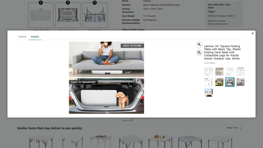
Step-by-Step Usage Images
If I had to pick one image type that directly cuts returns, it would be this one.
Step-by-step usage images show how the product is meant to be used from start to finish. I keep it simple: one step per image, one action per visual. No long sentences. No clutter.
These images act like a quick-start guide. They prevent customers from using the product incorrectly or assuming it works differently. Just as important, they show who the product is not for. When shoppers see the real usage flow, those with mismatched expectations self-filter before buying.
Size & Dimension Explainers
Source: Amazon
Size & dimension explainer images make scale obvious at a glance. I show measurements directly on the product, compare it to everyday objects, or place it in a real-world setting with context.
If compatibility matters, I spell it out visually. Compatible models, incompatible models, no guessing. When shoppers can clearly see size and fit, they stop making assumptions.
“Included vs Not Included” Images
I always include a clear visual that shows what’s in the box and what’s not. Every item is labeled. Nothing is implied. Nothing is left to interpretation. Many returns happen not because parts are missing, but because customers expected something extra. This single image removes that confusion completely. If your goal is fewer refunds, this image is non-negotiable.
Best Practices for Creating High-Converting Amazon Explainer Images
Here are proven best practices for improving conversion.
Short, Mobile-Readable Text
Around 70-75% of Amazon traffic comes from mobile devices, which means your copy must be short, bold, and readable within seconds. Aim for 3-5 words per line; if users need to zoom or slow down, you’ve already lost them.
One Image = One Idea
Each image should communicate one clear message, one benefit, one feature, or one problem solved. When you try to explain everything in a single image, shoppers process nothing.
Don’t Overload with Text
Explainer images are not spec sheets. If you’re adding paragraphs, you’re doing too much. Let visuals do the heavy lifting, and use text only to guide attention.
Clear Fonts, High Contrast
Use clean, sans-serif fonts and make sure there’s a strong contrast between text and background. If it’s hard to read on a small screen, it won’t convert.
Follow Amazon Image Guidelines
Avoid misleading claims, fake badges, pricing references, or promotional language. Violating Amazon’s image rules can hurt visibility or get your listing suppressed.
Explain First, Sell Second
Amazon shoppers are in research mode, not ad-viewing mode. The best explainer images educate clearly, build trust, and let the product sell itself. When customers understand, conversion follows.
Conclusion
Amazon explainer images don’t just boost conversion; they protect your business after the sale. When you clearly explain features, usage, size, and limitations upfront, shoppers buy with the right expectations. Fewer surprises mean fewer returns, better reviews, and a healthier listing over time.
1. Do explainer images really reduce Amazon product returns?
Yes. Explainer images align expectations before purchase. When shoppers clearly understand features, size, usage, and limitations, they’re less likely to feel misled, reducing “not as expected” returns.
2. How many explainer images should an Amazon listing have?
There’s no fixed number, but I usually recommend 3-5 strong explainer images. Each image should remove one key doubt: usage, size, compatibility, features, or what’s included.
3. Should explainer images focus more on selling or explaining?
Explaining comes first. On Amazon, clarity converts better than hype. When shoppers understand the product quickly and accurately, trust increases, and sales follow naturally.