Creating your online Storefront Architecture does not simply involve having products on a page. It is about providing a smooth, intuitive experience that helps shoppers find what they want without much trouble. The right type of catalog can make the user experience notably happier, reduce bounce rates, and boost conversions.
Key Principles of Storefront Architecture
It is important to grasp the main principles that make storefronts successful before sinking into them as templates.
Hierarchy & Navigation
There exists a well-defined hierarchy of products in a logical order, which makes it easy for users to navigate. Begin with general categories and go into sub-categories. Imagine it as a map of your customers’ journey.
In the absence of a clear hierarchy, shoppers might get lost or frustrated, leading to deserted carts. In fact, 60% of online stores don’t divide categories and subcategories into manageable chunks, which can make navigation even more confusing. Relevant navigation helps to discover and explore your catalog further.
Filter & Search
The shortcuts of your customers are filters and search functionality. They allow the user to filter options quickly by attributes such as size, color, price, or brand.
It may make the browsing experience unpleasant because a missing or inadequately designed filter can make the process frustrating. Make filters easy to use and visible, and add a search bar on all pages to support specific searches. Speed and clarity are valued among customers.
Consistency
Consistency builds trust. The fonts, colors, imagery, and tone of your home page, category pages, and product lists should be consistent. The uniform design reduces cognitive load, making it easier for shoppers to concentrate on products. It also reinforces your brand identity, making your store look professional with a polished touch.
Scalability
Your architecture must grow alongside your catalog. Adding new products or categories should be smooth and flexible. A scalable design prevents the need for a major redesign every time your business expands. Planning for growth early saves time, cost, and stress later.
Customer-Centric Approach
It all begins and ends with the customer. Know their pain points, motivations, and browsing habits. All layout choices, menu names, and product placement must be customer-friendly. A user-centered approach will improve satisfaction, loyalty, and, eventually, sales.
5 Catalog Templates of 10-200 SKUs

Having known the key principles, it is time to discuss 5 effective templates that are adapted to the catalogs of various sizes. The selection of the appropriate structure also provides the shoppers with the ability to find what they desire within the shortest time possible, and this will lead to a decrease in frustration and an increase in sales.
Template 1: Flat Layout (10-30 SKUs)
In small catalogs, a flat layout is used, where all products are displayed on a single page or in a continuous vertical list, eliminating the need for multiple clicks. The size, background, and camera angle should be similar to make the products’ image look clean. Titles ought to be brief, explicit, and include keywords to help customers know immediately what the product is.
The prices should appear directly below the title, and such labels as Bestseller or Featured should be placed on the highlighted products. If there are many products within the 20-30 range, you may divide them into smaller groups using divider lines or subheadings (Running Shoes, Casual Shoes) to avoid overwhelming customers.
This catalog can include simple filters, such as by price or primary color. The first products displayed should be the best-selling ones, followed by new arrivals. A vertical list on mobile devices can be easily scrolled, and larger images help distinguish products.
Template 2: Two-Level Categories (30-60 SKUs)
With the increase in products, categorizing them into main categories and subcategories makes it easier for customers to locate them. For example, the main category might be Shoes, and the subcategories might be Running, Sneakers, and Sandals. The first 6-10 products with high-quality images, concise titles, prices, and tags such as Hot or New may be displayed in each subcategory.
Add banners or icons to each major category to improve the visuals. You may use a distinct color for the banners, include an image of a sample product, or add a message such as Top Picks. The filters should be more specific than in a flat layout: price, color, size, or rating. Main category dropdowns must respond quickly and should not include deep navigation layers that may cause customers to drop off.
On desktops, hover menus let subcategories open without a click, whereas accordion menus conserve space on mobile.
Template 3: Grid-Based Layout (60-100 SKUs)
In the case of medium-sized catalogs, grid layout enables the customers to make comparisons of various products simultaneously. Normally, it uses 3-4 columns on desktop and 2 columns on mobile. They should have standard images and short titles, and the price should be shown immediately below.
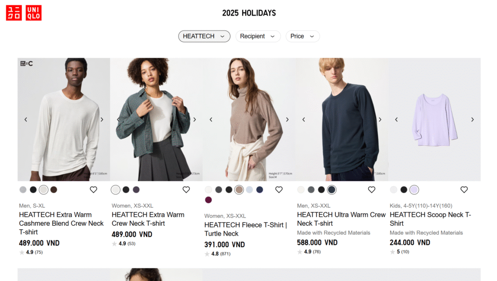
Source: Uniqlo
Grid layouts can include advanced filters: price, color, size, rating, or product features. Promotions (best-sellers, etc.) and featured products can be larger or have special labels. Display the products in a logical order; the first products should be new or best-selling ones, followed by popular products.
Grid layouts are also easy to scale: the addition of new products automatically inserts the layout without the need to edit the entire page. On mobile, apply progressive loading to have images load smoothly, thus creating a smooth experience.
Template 4: Mega Menu Layout (100-150 SKUs)
A mega menu is useful for large catalogs with many categories that do not require customers to scroll much. Top-level categories are represented in the main menus, and on hover or tap, subcategories appear with thumbnails.
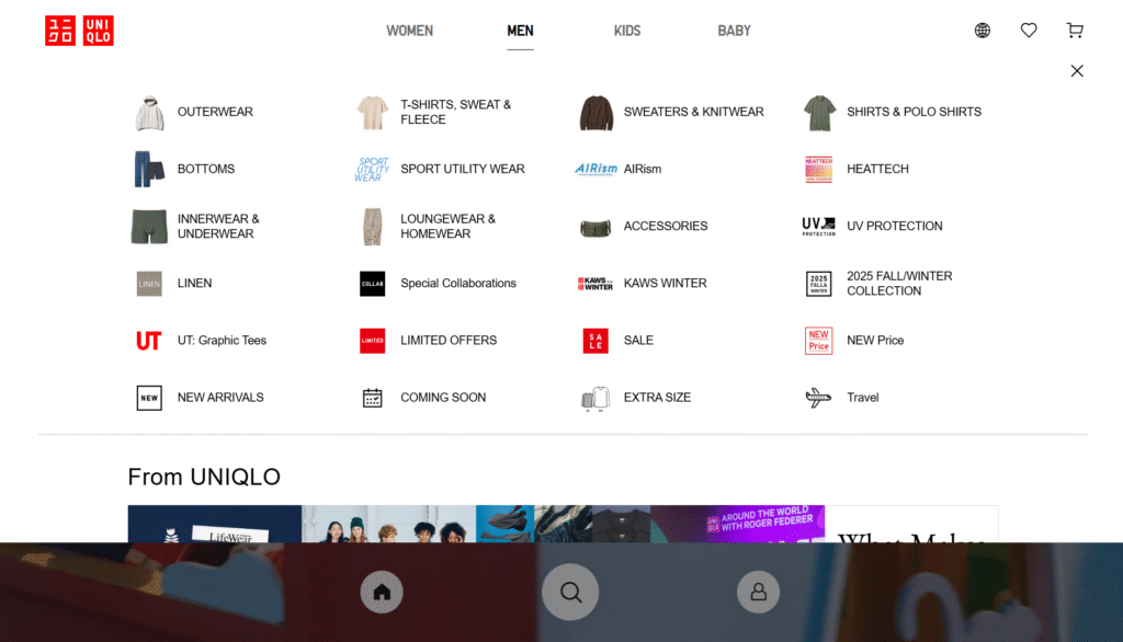
Source: Uniqlo
You may cluster products according to shopping intent: “New Arrivals, Top Rated, On Sale,” with special labels pointing to important items. The mega menu layout must be clean with groupings, each having 4-6 representative products displayed as images, titles, and prices.
After selecting a subcategory, filters should be displayed on the main page and allow filtering by price, rating, or popularity. The mega menu can be changed to an accordion list on mobile, and each subcategory can be collapsed to save space.
Template 5: Hybrid Layout (150-200 SKUs)
In very large catalogs, a mixed grid, list, and menu format can be used, allowing products of various types to be displayed flexibly. For example, new or popular goods will be shown in a grid, whereas minor products will be presented in lists with smaller picture sizes, longer titles, and shorter descriptions.
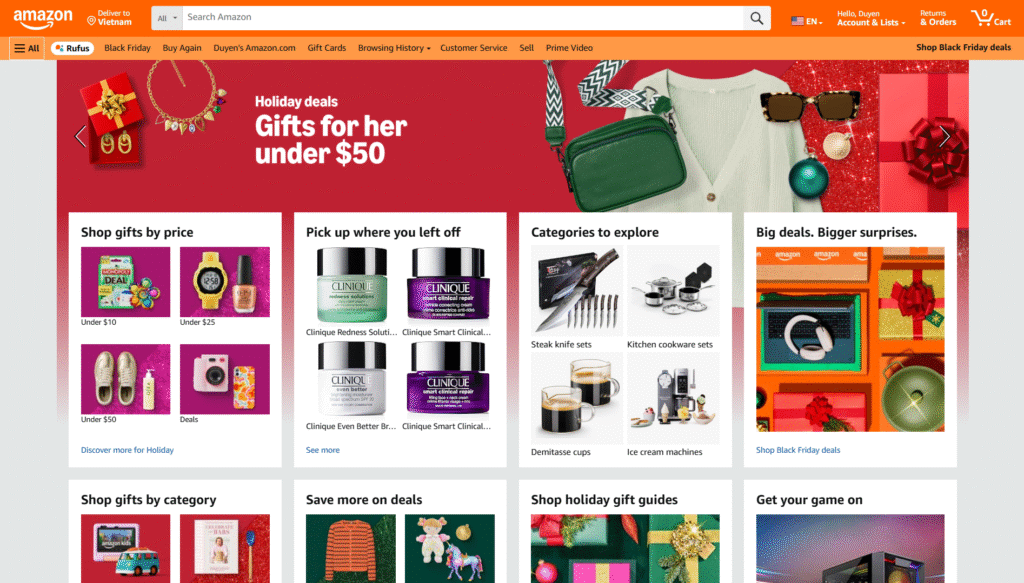
Source: Amazon
The menu is also a mega menu that lets you access the main and subcategories. These filters must be extensive and cover criteria such as price, color, size, rating, features, and brand. You can also add seasonal tabs or banners, e.g., Winter Collection and Back to School, and direct customers to specific product sets.
Hybrid layouts need to be responsive on mobile: grids can be reduced to 2 columns, lists can be viewed vertically, menus can be collapsed, and banners/tabs can be swiped horizontally. Improve loading and scrolling speeds so customers do not get bored by extremely long catalogs.
Implementation Tip
It is essential to test the layout with actual users before fully committing to any layout. Seeing how shoppers move through your catalog, where they stop, and what they have difficulty locating will provide you with actionable information.
Here’s a practical approach:
- Begin small: Implement your layout on a small scale for a small portion of visitors first. Gather clicks, dwell time, and exit-point information.
- A/B Test Points: A/B tests should be conducted with navigation paths, filters, sorting, and labeling. Even minor adjustments, such as renaming a menu item, for example, changing Accessories to Add-Ons, can influence the conversion rate.
- Record Usability Metrics: Monitor click-through rates, bounce rates, and time to find products to identify the best layout.
- Test and Improve: Use the data to adjust your layout. Don’t be afraid to simplify; complex menus or excessive filters can overwhelm users.
- Go Mobile-First: Many shoppers will be browsing on phones or tablets. Make sure your layout is easy to scroll, fast-loading, and responsive. What is a perfect design on a desktop can be irritating on a mobile device.
Conclusion
The selection of storefront architecture is not just a design endeavor but a strategic move. Properly designed catalogs will make shopping easier, create trust, and optimize selling.
Focus on clarity, scalability, and a customer-first approach. Try, revise, and sharpen your layout to suit your audience. A well-planned storefront is not only about selling; at the end of the day, it is about providing a friendly experience that encourages customers to revisit your site.
FAQs
What layout should be used with small catalogs?
A flat layout is best used with small catalogs (10-30 SKUs). It displays all products on a single page, which can be easily scanned and compared with one another. Clear navigation is achieved through consistent images and clear titles.
What about big catalogs?
Mega menus or hybrid layouts are beneficial when the catalog has a large number of SKUs (100 or more). Such layouts make navigation user-friendly because the shopper is not overwhelmed by navigation categories. A combination of featured and hierarchical menus enables better usability.
Are filters or hierarchy more important?
Hierarchy comes first. The web must be well-defined in categories and menus, which form the basis of navigation. Filters help refine the experience by allowing shoppers to narrow options efficiently once the structure is established.