A+ content can make your product stand out, build trust, and turn casual browsers into buyers. It’s where visuals meet words to tell your brand story and show why your product deserves attention. Done right, it increases conversions and reduces returns.
But many sellers underestimate how easy it is to slip up. Small missteps, confusing layouts, weak images, or unclear copy can erase all that potential. When your A+ content fails, it’s not just ugly; it hurts sales. Understanding the common mistakes and fixing them ensures your content works as hard as your product deserves.
What is Amazon A+ Content?
Amazon A+ Content is a way for sellers to make their product pages more appealing and clear. Instead of just a basic description and a few photos, brands can add bigger images, detailed text, charts, and comparison tables. It helps shoppers quickly understand what the product does, why it’s better than others, and how it works.
Think of it as giving your listing a mini brochure; everything is organized so people can see the value at a glance. Products with A+ Content often sell more because buyers feel confident and informed before hitting “Add to Cart.”
1. Focusing on design over value

Many Amazon sellers fall into the trap of making their A+ content look flashy but forget what matters most: convincing the buyer why the product is worth it. A polished design grabs attention, but if it doesn’t clearly communicate benefits, features, or solve a problem, it won’t drive sales. Competitors who balance design with clear value messaging often convert better because shoppers immediately understand why the product matters.
How to Fix It
- Highlight benefits first, not just visuals.
- Use clear, concise text alongside images.
- Show the product in real-life use cases.
- Avoid overloading with decorative graphics.
- Test layouts to see which combination of text and visuals converts best.
2. Not highlighting the Unique Selling Proposition (USP)
If your A+ Content doesn’t show what makes your product different, it blends in. That’s the issue. Many listings list features but never explain why those features matter, or why they’re better than others. Shoppers won’t figure it out for you. If your USP isn’t obvious, they move on.
Your USP is the reason to choose you. It could be better materials, a smarter design, or a specific use case. If it’s buried or unclear, your content loses impact fast.
How to fix it
- State your USP clearly in one strong line
- Focus on what makes your product different, not just good
- Connect features directly to real benefits
- Reinforce your USP across visuals and key sections
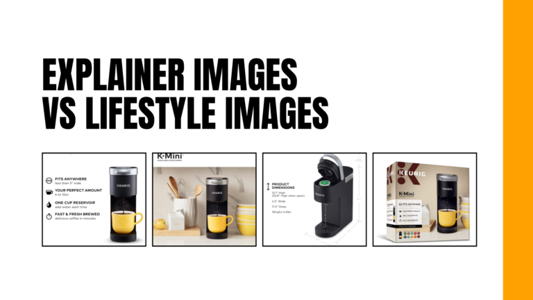
3. Using low-quality images
Low-quality images instantly drag your A+ Content down. Blurry photos, poor lighting, or stretched visuals make your product look cheap—even if it isn’t. On Amazon, shoppers can’t touch or test anything. They rely heavily on visuals. If your images feel unpolished, trust drops fast, and so does conversion rate.
Another common issue is inconsistency. Mixing different styles, backgrounds, or color tones creates a messy look. It confuses the viewer and weakens your brand identity. Clean, sharp, and cohesive visuals are what keep people scrolling and buying.
How to fix it
- Use only high-resolution images (sharp, clear, no pixelation)
- Keep visuals consistent (same lighting, background, color tone)
- Avoid resizing that distorts proportions
- Invest in clean, professional product shots (simple setup is enough if done right)
4. Overloading with text
Too much text kills attention fast. A+ Content isn’t the place to explain everything in long paragraphs. Shoppers don’t read like that on Amazon. They scan. If your section looks dense or wordy, they skip it.

Another problem is trying to sound “professional” with heavy, complicated wording. It slows people down. Clear, simple copy works better. You’re not writing a blog or telling a full story, you’re helping someone decide in seconds.
How to fix it
- Cut paragraphs into short, scannable lines
- Focus on key benefits, not full explanations
- Use bullet points instead of dense text blocks
- Pair text with visuals to reduce reading load
5. Not mobile-optimized
70-75% Amazon shoppers are on their phones. If your A+ Content is built for desktop first, it will break on mobile. Text becomes tiny, images feel cramped, and layouts stack in awkward ways. What looked clean on a big screen turns messy fast.
A common mistake is cramming too much into one module. On mobile, everything stacks vertically. Long sections force users to scroll too much, and they lose interest. Another issue is small fonts baked into images; once scaled down, they’re unreadable.
Mobile users move quickly. If they can’t understand your product in a few seconds, they bounce. Clear structure and spacing matter more than fancy design. Simple layouts almost always perform better here.
How to fix it
- Design with mobile first, then adapt to desktop
- Keep text short and large enough to read on small screens
- Avoid overcrowded modules; use more spacing
- Test how your A+ Content looks on actual mobile devices
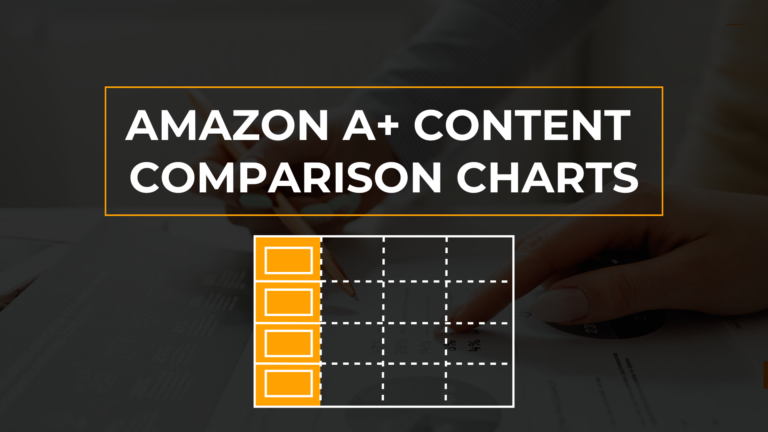
6. Skipping comparison charts
Many sellers ignore comparison charts, and that’s a missed opportunity. Shoppers often compare options before buying. If you don’t guide that process, they’ll leave your listing to check others, and might not come back.
A good comparison chart keeps users on your page. It shows how your product stacks up against other variants or models in your own catalog. More importantly, it helps buyers choose faster. Without it, people feel uncertain, especially when you offer multiple similar products.
Relying only on text to explain differences. That slows decision-making. A clean chart does the job in seconds. It reduces confusion and builds trust because everything is clear and structured.
How to fix it
- Add a simple comparison chart for your product range
- Highlight key differences (features, size, use case)
- Keep the layout clean and easy to scan
- Focus on helping users choose, not overwhelming them
7. Ignoring the brand story
People don’t just buy products; they buy trust. If your A+ Content skips the brand story, you’re leaving that trust on the table. A product might look good, but without context, it feels generic. That’s a problem, especially in crowded categories.
Shoppers want to know who’s behind the product. Where does the brand come from? What does it stand for? Why should they believe your claims? If you don’t answer these, buyers hesitate. Or worse, they move to a competitor who does.
A strong brand story doesn’t need to be long. It just needs to feel real and clear. Show your values, your purpose, and what makes you reliable. Done right, it makes your product easier to trust, and easier to choose.
How to fix it
- Add a short, clear brand story (keep it focused and human)
- Highlight your core values and what you stand for
- Show proof: certifications, experience, or real background
- Use visuals that reflect your brand identity and tone
Conclusion
A+ Content usually breaks when it tries too hard to impress instead of helping people decide. Clean design, nice images, and long descriptions don’t mean much if the message isn’t clear.
Shoppers move fast. They want to understand the product, trust it, and feel confident enough to buy, all in a few seconds. When your content removes confusion and answers real questions, everything changes. It feels easier to read, easier to trust, and easier to act on. Strip things back, keep your message sharp, and let every section do a real job. That’s what actually drives conversions.
1. What makes good A+ Content on Amazon?
Good A+ Content is clear, easy to scan, and focused on helping shoppers decide quickly. It combines strong visuals with short, benefit-driven text so customers understand the product without effort.
2. Why is my A+ Content not converting?
Most of the time, it’s because the content is too cluttered or unclear. If shoppers can’t quickly see what makes your product worth buying, they lose interest and move on.
3. How do I improve my A+ Content quickly?
Start by simplifying everything. Cut unnecessary text, highlight key benefits, and make sure each section answers a real customer question. Clear, focused content performs better than complex design.