Shoppers rarely read every word on an Amazon listing. They scan, compare, and decide in seconds. That’s why a well-built comparison chart inside Amazon A+ Content can quietly drive more conversions than a long block of text.
The best charts make choices obvious. They highlight differences, guide buyers toward the right product, and remove doubt before it slows the purchase. In 2026, brands that treat comparison charts as a strategy, not just a design element, are the ones winning the click.
What Are Amazon A+ Content Comparison Charts?

Comparison charts are one of the most practical modules brands use inside Amazon A+ Content. Instead of long explanations, they present product differences in a format shoppers can understand at a glance.
Definition and Purpose
An Amazon A+ Content comparison chart is a visual table that places several products side by side so shoppers can quickly see the differences. Most brands use this section to compare multiple ASINs within the same catalog. Instead of forcing buyers to open several product pages, the chart shows key features in one clean layout.
Typical rows include product type, core features, size options, materials, or ideal use cases. Each column represents a product from the same brand. The goal is simple: help customers understand which item fits their needs without digging through long descriptions.
Why Comparison Charts Increase Conversions
Online shoppers move fast. A comparison chart helps them process information in seconds. The chart shows real differences between products by putting them next to each other based on price range, features, size, or intended use. That clarity takes away doubt. Buyers don’t have to guess which choice is best for them.
Using comparison charts on a product page lowers the bounce rate. Instead of having to leave to look for another listing, shoppers can look at other products from the same brand right on the page. A lot of sellers use this space to show off higher-end models or other items that go with them.
Key Elements of a High-Converting Amazon Comparison Chart
A comparison chart works best when it removes confusion. Shoppers should understand product differences in seconds, not minutes.
Clear Product Positioning
Every product in the chart should play a clear role. Think of it as a lineup: basic, premium, and professional.
The basic option usually focuses on price and simplicity. The premium version adds extra features or better materials. The professional model targets users who need advanced performance.
When shoppers see this structure, they immediately understand where each product fits. It prevents overlap and makes upgrades feel logical. A buyer looking for something simple picks the entry model. Someone who wants more features naturally moves up the ladder.
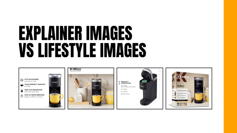
Visual Product Images
Images carry a lot of weight in comparison charts. Shoppers scan pictures before they read anything.
Use clean, high-resolution product images that match across all columns. The angle, lighting, and size should stay consistent. When images look aligned, the chart feels organized and easy to read.
If one product image is zoomed in while another is far away, the layout becomes messy. Consistency keeps the focus on product differences instead of visual distractions.
Concise Feature Descriptions
Long blocks of text make it hard for people to read quickly. Short, bullet-style descriptions work best with comparison charts. Each row should show off one clear feature that buyers care about. Sometimes a few words are better than a whole sentence. The goal is to scan quickly, not read deeply.
Logical Feature Categories
A good chart puts features into groups that make sense. This layout makes it easier for shoppers to understand things quickly.
Size or capacity, key functions, target users, and special features are some of the most common categories. These parts are like how people naturally judge things they want to buy.
For instance, a comparison chart might look like this:
- Size and capacity: dimensions, weight, and storage space
- Key Functions: main features or core abilities
- Target Users: beginners, casual users, and professionals
- Unique advantages that make the product stand out are called “special features.”
The chart makes sense when the information is in a clear order. Shoppers can easily choose the right product because they can go from general information to specific benefits without getting lost.
Best Design Practices for Amazon A+ Comparison Charts

When the design is clean and focused, shoppers can scan the chart in seconds and understand which product fits their needs. Good design removes friction and keeps the page easy to navigate inside an Amazon listing.
Keep the Layout Simple
Limit the chart to three to five products. That range keeps the layout clear and easy to scan.
When a chart includes too many products, the table becomes crowded. Extra columns force shoppers to move their eyes back and forth just to compare basic features. Most buyers won’t spend that much time on a product page.
A smaller set of products makes the differences easier to see. Shoppers can quickly understand which option is basic, which one offers more features, and which one sits at the top tier.
Use Icons and Visual Indicators
Use visual signals to make comparisons faster. Checkmarks work well for showing whether a product includes a specific feature. Instead of reading full sentences, shoppers can scan across the row and instantly spot differences.
Icons help in the same way. Simple visuals for things like battery life, waterproof design, or connectivity communicate information faster than text. Keep the icons limited. A few clear indicators improve readability. Too many visuals quickly turn the chart into clutter.
Maintain Brand Consistency
Design the chart so it matches the rest of the listing. Use colors that follow the brand guideline. Keep typography consistent with the other A+ sections on the Amazon page. Maintain the same spacing and alignment used across the layout. This consistency makes the listing feel more professional. When the design looks unified, shoppers trust the brand more and navigate the page more easily.
Mobile-Friendly Design
Mobile devices now account for nearly 60% of all Amazon traffic, which means a large share of shoppers browse listings on smaller screens. A comparison chart should therefore be designed with mobile users in mind.
Long descriptions don’t work well on phones. Feature text should stay short and direct so shoppers can scan without zooming.
How to Structure Comparison Charts for Maximum Conversions
A comparison chart should make the decision easier for shoppers. When the layout is clear, people can quickly scan the chart, see the differences, and figure out which product fits them best. On a busy Amazon product page, that kind of clarity really helps.
Highlight the Hero Product
Choose one product to be the hero. This is the thing you want to sell the most. Put it where the eye naturally goes, which is often in the middle column. Some brands make it stand out with a small label or a small change in design.
The hero product usually has the best combination of features and price. It costs more than the other options, but it gives you a lot of value. This product should be the clear choice when shoppers look at the chart.
Arrange Products from Basic to Premium
Put the items in order from least to most expensive. This makes it easier to read the chart. Most of the time, shoppers start with the easiest choice. Then they move across the chart to find out what extra features come with more expensive products.
It should be clear that each step is an improvement. Maybe the premium version has more space, stronger materials, or more advanced features. When the order makes sense, buyers can compare products without getting confused.
Emphasize Unique Selling Points
There should be something special about each product. The chart isn’t useful if all the columns show the same features. People who are shopping need to know why one choice costs more than another.
For each item, point out one or two features that stand out. It could be bigger, work better, or have a feature that is meant for a certain user. It’s easier to make a choice when the differences are clear.
Conclusion
A good comparison chart makes it easier for people to make a choice. Buyers can quickly understand their options when the layout is simple, the features are clear, and the products are in a logical order. Brands that use comparison charts as a strategic part of their Amazon A+ Content see increased click-through rates, reduced site abandonment, and boosted sales across their entire product range.
1. Why are comparison charts important for Amazon product pages?
Comparison charts help shoppers see the differences between products quickly. Instead of reading long descriptions, they can scan the chart and understand which option fits their needs. This makes the buying decision faster and easier.
2. What should a good comparison chart include?
A good comparison chart should show clear product differences, key features, and a logical product order. Many brands also highlight one main product to guide shoppers toward the best-value option.
3. How can comparison charts improve conversions?
When shoppers understand the options easily, they feel more confident about choosing a product. This clarity often reduces hesitation and increases the chances of a purchase.